Thanks again for the wonderful turnout for the sale! :)

Monday, December 9, 2013
Cyber Monday Packages
One final update on the packages from the Cyber Monday sale... The last of the packages went out tonight, though it was after the last pickup so they should get moving tomorrow.
Saturday, December 7, 2013
Cyber Monday Packages
Quick update: any packages from Cyber Monday’s sale that haven’t already shipped will ship on Monday.
Thanks so much for the purchases and your patience! And as always, please email ContraryPolish@gmail.com with any questions. :)
Thanks so much for the purchases and your patience! And as always, please email ContraryPolish@gmail.com with any questions. :)
Monday, December 2, 2013
Cyber Monday Sale
It’s time! From now until 4 pm CST, I will be accepting full-size and mini orders via email. The prices for the new winter collection are $10 for full-size and $5 for minis, and the prices for all older colors are $8 for full-size and $4 for minis (a discount of 20%).
I have bottle pictures of the new collection to share with you! However, if you would rather wait for swatches (or if you just miss this sale), don’t worry because there will definitely be future opportunities to get this collection. :)


Note: This polish is quite a bit more purple/less blue than it appears in these photos. The base color is similar to OPI Sapphire in the Snow, if that helps you to picture it. :)


I have bottle pictures of the new collection to share with you! However, if you would rather wait for swatches (or if you just miss this sale), don’t worry because there will definitely be future opportunities to get this collection. :)
Contrary Polish On the Rocks - Winter 2013
Tiger’s Eye (bronzy brown with metallic gold shimmer)


Graphite (muddled grey jelly with varied shimmer/micro-flakes - gold, silver, pink, grey)


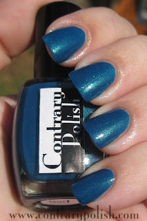
Obsidian (purple near-black jelly with varied color-shifting shimmer - green and blue shifting to pink and blurple)


Almandine (oxblood red with gold to green color-shifting shimmer)


Fluorite (blurple with green to pink color-shifting shimmer)
Note: This polish is quite a bit more purple/less blue than it appears in these photos. The base color is similar to OPI Sapphire in the Snow, if that helps you to picture it. :)


Dioptase (bluish green with antique gold and green shimmer)


Please see the sidebar for details on how to place an order, and thank you for visiting my blog!
Sunday, December 1, 2013
Cyber Monday Announcement
Hello! I’m excited to share the news of my Cyber Monday sale with you all. :)
Tomorrow from 12 pm to 4 pm (CST), I will be accepting orders at a discount of 20% off my usual prices. That will make full-size bottles $8 and mini bottles $4 (plus shipping).
I will also be introducing my winter collection at the same time, though the winter polishes will only be available at full price: $10 for full-size, $5 for mini.
This new collection is called Contrary Polish On the Rocks, and the shade names and base colors were inspired by various minerals.
I will post bottle pictures of the new polishes at noon tomorrow, but to give you an idea of what’s coming, here are the shade names and descriptions:
Tiger’s Eye (bronzy brown with metallic gold shimmer)
Graphite (muddled grey with various shimmer/micro-flakes - gold, silver, pink, grey)
Obsidian (purple-tinted black with various color-shifting shimmer - blue and green shifting to blurple and pink)
Almandine (oxblood red with gold to green color-shifting shimmer)
Fluorite (blurple with green to pink color-shifting shimmer)
Dioptase (bluish green with antique gold and green shimmer)
Please see the sidebar if you're not familiar with the email ordering process, and please feel free to send any questions to ContraryPolish@gmail.com.
See you tomorrow at noon! :)
Friday, October 11, 2013
Mini Bottles: No Place Like Home
I'm having trouble updating the sidebar, so I wanted to write a quick post confirming that the No Place Like Home collection (The Plaza, The Boulevard, Westport, River Market, 18th & Vine, West Bottoms) is now available for mini bottle orders. :)
Monday, October 7, 2013
Preview: No Place Like Home

My fall collection launches tomorrow on Llarowe, so I wanted to give you guys a small preview of the inspiration behind the collection.
The collection is called No Place Like Home and the polishes are named after different neighborhoods in my hometown of Kansas City.
The Plaza (concrete grey with ruby red, bright blue, and yellow shimmer/microglitter)
This shade was inspired by the Court of the Penguins fountain on the Country Club Plaza.

The Boulevard (muted navy jelly with orange shimmer/microglitter)
This shade was inspired by the wall painting at La Bodega on Southwest Boulevard.

Westport (dusty olive green with varied gold shimmer)
This shade was inspired by the sign painted on the outside of Kelly's in Westport.

Westport is an entertainment district with plenty of restaurants, bars, and shopping. I suppose it's a little like a grittier version of the Plaza. And while it's older than the Plaza (around 150 years compared to the Plaza's almost-100, if I recall correctly), it tends to attract a younger crowd.
Kelly's is an Irish bar at the corner of Westport Rd and Pennsylvania Ave. One thing that makes it stand out is the small pizza place located in the rear. A slice really hits the spot after a long night out!
River Market (dark purple jelly with raspberry shimmer/microglitter)
This shade was inspired by blackberries and raspberries at the City Market farmers' market in the River Market.

The River Market is another historic neighborhood in Kansas City, and the anchor attraction is the City Market farmers' market which is open year-round on Saturdays and Sundays. The farmers' market is certainly an easy place to draw inspiration from! Between the fruits/vegetables and the flowers, it is a riot of color. There were plenty of options to choose from, but I ended up most inspired by the color combination of the blackberries and raspberries.
18th & Vine (deep periwinkle with pink shimmer)
This shade was inspired by the color of the walls at The Blue Room in the 18th & Vine district.

The Blue Room is a jazz club in the historic 18th & Vine jazz district. I was there earlier this summer and as soon as I saw the walls I knew I wanted to create a polish with a similar color combination. The walls are a blue-purple and the trim is a red-purple, and the overall effect is striking. My red-purple shimmer leans more pink than I intended, but I think I captured the general idea. :)
West Bottoms (fluorescent yellowish green with gold to green shimmer; glow in the dark and UV-reactive)
This polish is pretty different from what I usually do, but I wanted to have one polish in this collection be a "Halloween" polish... and this is the perfect polish for that since this shade is inspired by The Beast Haunted House in the West Bottoms area. :)

The West Bottoms is known for its haunted houses that open for business every fall. I've been going since I was a teenager and honestly, they creep me out almost as much now as they did then! They're the perfect combination of creepy and cheesy. :)
This polish is both glow-in-the-dark and blacklight/UV reactive. Naturally the glow is at its strongest when it's worn alone, but it's still pretty darn strong when layered! When layered one coat over black, the effect under blacklight is very strong (though you have to be careful to make the layer very even during application if you're only going to do one layer; otherwise the blacklight effect can look patchy), and the glow-in-the-dark effect was strong enough to creep my husband out the first night I wore it to bed. ;) As far as longevity goes, I charged my one-coat-over-black mani in the evening before bed (around 15 seconds with a flashlight) and I could still see a glow when I woke up the next morning.
I have daylight pictures to share of this polish so you can see a bit of its layering potential. (I'll leave the glow-in-the-dark/blacklight pictures to the bloggers, because my attempts to capture it in the dark were horrendous!) The first two swatch pictures show one coat West Bottoms over black, and the second two swatch pictures show two coats over black.


For swatches of all the colors in this collection, please see Vampy Varnish. Sometime tomorrow, I think The Polishaholic and Chalkboard Nails will have swatches up too. :)
This collection will be available on Llarowe starting tomorrow at 1:00 pm CST, and mini bottles will be available on my blog starting this Friday. Please see sidebar for details on how to place an order, and please let me know if you have any questions or comments.
Thanks so much for visiting my blog!
Friday, August 16, 2013
Small Change to Friday Orders
Happy Friday, guys! I have a small announcement to share.
As most of you know, I take mini bottle orders via this blog every Friday (details in sidebar). From now on, I will also accept some full-size bottle orders every Friday, but only for the shades from my holiday collection from last year: Mystery, Candle Light, Adorned, Bauble, Frozen, and Spruce. Full-size bottles are $10 each.
I'm making this change because my main etailer (Llarowe) no longer carries that collection, and I'd like my customers who prefer full-size bottles to still have easy access to those shades. :)
Please email me at ContraryPolish@gmail.com if you have any questions, and thanks for reading!
Thursday, July 11, 2013
Swatches/Sale: Paper Anniversary Gift Wrap
I almost can't believe it, but Contrary Polish has been in business for one year today! To celebrate this anniversary, I'm holding a full-bottle sale now through Friday evening (if supplies last), and I have a new shade to offer as well. :)


Gift Wrap (red-toned purple with blue-green shimmer; shimmer slightly shifts from blue-green to blue-purple)
I spent a LONG time working on anniversary polishes, but it was worth it because I'm so happy with the result!
Since the first anniversary is traditionally the paper anniversary, I used that as my jumping off point. I initially tried and rejected two other ideas: Recycled Paper (I could see it in my head but couldn't find the right supplies to make it happen) and Paper Lantern (very pretty but too ordinary). I ended up being inspired by some amazing wrapping paper, and Gift Wrap was born. :)
This polish dries with a satin finish before top coat. It has a bit of a jelly consistency but with good coverage. These swatches show two coats Gift Wrap (one thinner coat and one thicker coat) and one coat Seche Vite.
Please disregard the shade name label in these pictures; there was a last-minute name change.


Please see sidebar for details on how to place an order, and please let me know if you have any questions or comments.
Thanks so much for visiting my blog!
Thursday, July 4, 2013
Giveaway Results
The giveaway has ended and we have a winner - congratulations to Joyce R.! I just emailed you to get your shipping information so I can send the new trio your way.
Thanks so much to everyone who entered the giveaway! The new trio will be launched on Llarowe today at 2:00 pm CST, and mini bottles will be available via the blog tomorrow. :)
Tuesday, July 2, 2013
Preview/Giveaway: Color Context
I have a preview and giveaway to share with you today!
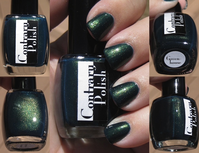
My second summer collection is a trio called Color Context, and the shades in it are Greenhouse, Blood Orange, and Indigo Rose.


a Rafflecopter giveaway
My second summer collection is a trio called Color Context, and the shades in it are Greenhouse, Blood Orange, and Indigo Rose.
Greenhouse (blue base with gold shimmer; overall polish looks green)
Blood Orange (red base with gold shimmer; overall polish has an orange tint)

Indigo Rose (blue base with red-orange shimmer; shimmer appears red-purple and gives overall polish a purple tint)

These shades will launch on Llarowe later this week and mini bottles will be available this Friday. In the meantime, I'd like to host a giveaway. :)
This giveaway will only be up for two days, so sign up now for a chance to win a full-size bottle of all three new shades!
Saturday, April 20, 2013
Ain't That a Beach: Summer 2013
I have more swatches of my new trio to share with you today!
This new collection is called Ain't That a Beach, and the shades names are Surf, Sand, and Sky. The collection will launch on Llarowe today at 2 pm and 8 pm (CST), and next Friday they will be on the list of shades available for mini bottle orders via this blog.
The microglitter didn't show up well in these pictures but it's apparent in real life. The effect I was going for was blue base = deeper water, green shimmer = shallow water, blue/green microglitter = wave peaks. :)
These swatches show two coats Surf and one coat Seche Vite.


I anticipated questions about how Surf compares to Aruba, so I swatched them side by side. (I also included Bright Night for comparison, though you can see that it is much darker than the other two.) Aruba is greener and dustier, and Surf is brighter/more vibrant.
Surf is on index and ring fingers, Aruba is on middle finger, and Bright Night is on pinky.


The brown microglitter adds some depth to the background and the metallic gold shimmer overlays it all with sparkly goodness. The shimmer is super strong; you can see it in all light but it especially goes crazy in the sun. (Unfortunately my camera couldn't catch the actual level of bling.)
These swatches show two coats Sand and one coat Seche Vite.


I also anticipated questions as to how this compares with Hayride. Hayride's base is more of a camel color and its shimmer has more of a copper sheen. Hayride also has varied sizes of brown microglitter, while Sand only has the smallest size available.
Sand is on index and ring and Hayride is on middle and pinky.


You might be able to tell that I was going for a clear sunny sky with this one. :)
The blue microglitter is very close to the base color, so rather than contrasting with it like usual, it only adds a bit of depth to the base. Like in Sand, the gold shimmer is very apparent in this polish... and also like in Sand, my camera had trouble capturing the actual shimmer. So please imagine it more sparkly than this!
These swatches show two coats Sky and one coat Seche Vite.


This new collection is called Ain't That a Beach, and the shades names are Surf, Sand, and Sky. The collection will launch on Llarowe today at 2 pm and 8 pm (CST), and next Friday they will be on the list of shades available for mini bottle orders via this blog.
Surf (green-leaning blue with bright green shimmer and blue/green microglitter)
The microglitter didn't show up well in these pictures but it's apparent in real life. The effect I was going for was blue base = deeper water, green shimmer = shallow water, blue/green microglitter = wave peaks. :)
These swatches show two coats Surf and one coat Seche Vite.


I anticipated questions about how Surf compares to Aruba, so I swatched them side by side. (I also included Bright Night for comparison, though you can see that it is much darker than the other two.) Aruba is greener and dustier, and Surf is brighter/more vibrant.
Surf is on index and ring fingers, Aruba is on middle finger, and Bright Night is on pinky.


Sand (dirty tan with gold shimmer and brown microglitter)
The brown microglitter adds some depth to the background and the metallic gold shimmer overlays it all with sparkly goodness. The shimmer is super strong; you can see it in all light but it especially goes crazy in the sun. (Unfortunately my camera couldn't catch the actual level of bling.)
These swatches show two coats Sand and one coat Seche Vite.


I also anticipated questions as to how this compares with Hayride. Hayride's base is more of a camel color and its shimmer has more of a copper sheen. Hayride also has varied sizes of brown microglitter, while Sand only has the smallest size available.
Sand is on index and ring and Hayride is on middle and pinky.


Sky (sky blue with gold shimmer and blue microglitter)
You might be able to tell that I was going for a clear sunny sky with this one. :)
The blue microglitter is very close to the base color, so rather than contrasting with it like usual, it only adds a bit of depth to the base. Like in Sand, the gold shimmer is very apparent in this polish... and also like in Sand, my camera had trouble capturing the actual shimmer. So please imagine it more sparkly than this!
These swatches show two coats Sky and one coat Seche Vite.


Please see sidebar for details on how to place an order, and please let me know if you have any questions or comments.
Thanks so much for visiting my blog!
Subscribe to:
Posts (Atom)